The most powerful website builder in 2025 isn’t measured by its features.
It’s measured by its ability to understand you.
In the age of vibe-coding and AI website builders, your ability to communicate your vision clearly has become the new superpower. The gap between imagination and implementation no longer depends on technical skills—it depends on communication skills.
Let me show you how to master this new language of creation.
Why Communication Is the New Coding
Traditional development required translating your vision into technical specifications, wireframes, and code—a process filled with compromise and misinterpretation.
Even first-generation AI website builders still forced you to think in terms of layouts, components, and design systems.
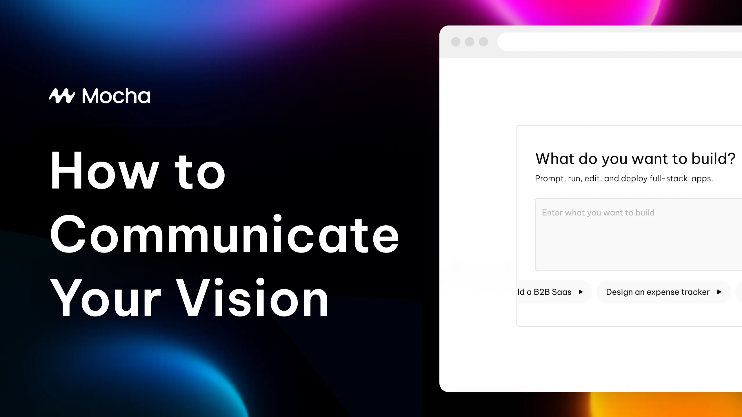
But with Mocha’s vibe-coding approach, the entire paradigm has shifted. Now, your words directly shape your digital reality. No intermediary language. No technical translation.
Just conversation.
This shift makes how you communicate your vision the most critical factor in creating perfect builds.
The Clarity Principle: Start With Purpose, Not Features
The most common mistake when describing your vision to an AI website builder is jumping straight to features and aesthetics.
Start with why, not what.
Before describing a single visual element or feature, clearly articulate:
- Core Purpose: What problem does this digital experience solve?
- Target Audience: Who will use this, and what matters to them?
- Key Outcomes: What should users be able to accomplish?
- Emotional Impact: How should users feel when engaging with this?
This foundation gives the AI website builder crucial context that shapes every subsequent decision.
Example of Poor Communication: “I need a modern website with a hero section, testimonials, and a contact form.”
Example of Effective Communication: “I’m creating a platform for busy professionals seeking mental health support. They value privacy, simplicity, and feeling understood. The site should project calm professionalism while making it effortless to connect with therapists. Users should leave feeling hopeful and supported.”
The second example provides rich context that shapes everything from color choices to user flows—all before mentioning a single feature.
The Specificity Spectrum: When to Be Detailed vs. Conceptual
Knowing when to be specific and when to be conceptual is critical when communicating with Mocha’s AI website builder.
When to Be Highly Specific:
- Unique Functionality: If you need specific, unusual functionality
- Brand Elements: Colors, typography, and other brand-specific requirements
- Content Structure: How information should be organized and prioritized
- Critical User Flows: Exactly how users should move through key processes
Example: “The consultation booking process should allow users to select their issue first, then show only therapists specializing in that area, followed by available time slots. Each step should happen on the same page without reloading, with gentle animations between steps.”
When to Be Conceptual:
- Overall Aesthetic Feel: The emotional tone and style
- Creative Elements: Areas where you want AI-driven innovation
- Standard Functionality: Common features that don’t need reinvention
- Visual Hierarchy: The relative importance of elements
Example: “The overall aesthetic should feel like a calm, early morning in a sunlit room—warm, hopeful, but professionally reassuring. Give prominence to therapist profiles and their specialties.”
The Visual Language: Beyond Words
Sometimes words alone can’t fully capture your vision. In these cases, supplement your descriptions with:
References and Examples
Rather than trying to describe every detail of a complex interface, point to existing examples:
“The user dashboard should organize information similar to how Notion uses cards and lists, but with our calming color palette and more white space between elements.”
This gives the AI website builder a clear reference point while still allowing for your unique requirements.
Metaphors and Analogies
Abstract concepts like “flow” and “feel” can be difficult to articulate directly. Metaphors bridge this gap:
“The transition between pages should feel like turning pages in a well-crafted book—deliberate but effortless, with a moment to appreciate the new content.”
Emotional Descriptors
Emotions cut through technical ambiguity:
“The testimonials section should feel intimate and reassuring, like hearing a friend’s recommendation rather than reading a formal review.”
The Iteration Dialogue: Refining Through Conversation
Perfect builds rarely happen in a single description. The magic of Mocha’s approach is the iterative dialogue:
- Start Broad: Begin with your overall vision and purpose
- Respond to What Materializes: React to what the AI creates
- Focus on Feelings, Not Just Features: Describe what feels right and wrong
- Explore Alternatives: Ask to see different approaches to key elements
- Build Complexity Gradually: Add sophisticated elements after the foundation is solid
This conversational approach mirrors how you’d work with a talented human designer, but happens in minutes rather than days or weeks.
Example Iteration Dialogue:
Initial request: “Create a calming mental health platform for busy professionals.”
After seeing the initial build: “The overall structure works well, but the blue feels too corporate. Let’s shift toward warmer, more natural tones that evoke calmness without feeling clinical.”
After color adjustments: “The colors are perfect now. The navigation feels a bit overwhelming though. Can we simplify it to focus on just three key actions: learn, match with a therapist, and book a session?”
After navigation changes: “That’s much better. Now let’s make the therapist matching more engaging. Perhaps an interactive questionnaire that helps users identify what they’re looking for?”
Each iteration builds on the previous one, getting closer to your perfect vision.
Real-World Success: Tom’s Manufacturing Portal
Tom, CEO of a manufacturing company, needed a partner portal but struggled to communicate his vision to traditional developers.
Using the communication principles we’ve outlined, he transformed his approach:
Before: “We need a partner portal with login functionality, document sharing, and order tracking.”
After: “We’re creating a central hub for our manufacturing partners who need quick access to specifications, order status, and communication channels. These are busy factory managers who value efficiency above all else. The experience should feel streamlined and trustworthy, prioritizing rapid access to critical information without unnecessary clicks or visual distractions.”
The result? A partner portal that perfectly matched his business needs, created in hours instead of months.
“What I found Mocha enables me to do, especially on the technology front, is to run through a wall with the ability to make what I want. And regardless of how it actually works, I can then come back to my software, my tech, my engineer and say, I sketched out what I want. And now we just need to fill in the cracks there.”
Communication Patterns to Avoid
Certain communication patterns consistently lead to suboptimal results with AI website builders:
1. Template Thinking
Avoid: “Make it look like [popular template] but with our logo.”
Instead: “Create an experience that embodies our brand values of [specific values] while accomplishing [specific goals].“
2. Technical Specification
Avoid: “Use a responsive grid with 12 columns and 20px gutters.”
Instead: “Ensure the layout adapts beautifully across all devices, maintaining visual harmony and readability.”
3. Feature Fixation
Avoid: “Add a dropdown menu, hero banner, and testimonial carousel.”
Instead: “Create an intuitive navigation system, a compelling introduction to our value proposition, and authentic social proof from our customers.”
4. Vague Aesthetics
Avoid: “Make it modern and professional.”
Instead: “Create a visual identity that balances forward-thinking innovation with established expertise, using clean lines and purposeful white space.”
The New Language of Creation
As we move deeper into the era of vibe-coding and AI website builders, a new language of digital creation is emerging—one based on purpose, emotion, and vision rather than technical specifications.
The builders who will thrive aren’t those with the most technical knowledge, but those who can most clearly articulate their unique vision.
This shift democratizes digital creation in unprecedented ways. Your ability to build exactly what you imagine no longer depends on coding skills or design expertise—it depends on your ability to communicate clearly.
The barrier between imagination and implementation is dissolving. The translation gap between vision and reality is closing. The future of creation is conversational.
Master the art of describing your vision, and watch as Mocha transforms your words into perfect digital reality—exactly as you imagined it.